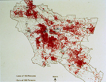
This dot distribution map shows the total Hispanic population of Los Angeles.
A dot distribution map is a map which shows a pre-defined numeric value, and its intensity in a pre-defined area, as dots on the map. Even though some of the red areas on this image appear to be connected, they only appear this way because if the dots were made smaller, in an attempt to show seperation, they would not be visible. If the Hispanic population in this area were lower, and more widespread, the dots could potentially be further apart and easier to define in an individual manner.
No comments:
Post a Comment